Implementing fluid design using the CSS calc() function
By Henry Kirkness - 13 April 2022
4 Min Read
Until recently, CSS was a common moan within web development, we complained that X browser wouldn't support Y or that we needed to build custom grid systems to meet our project needs. We've come a long way, most of us use CSS Grid and Flex pretty freely and long-gone are the days of installing a Bootstrap for its Grid System.
Now that developers have mostly quit their moaning about CSS the focus has moved to designer-developer handoff and as part of that, the management of design systems. One such application is outlined in Atomic Design by Brad Frost. By using design systems and creating a single source of truth for them, developers and designers can be at peace knowing that the designer's design isn't being murdered by the developer and that the designer isn't designing anything beyond what's sensible.
Design Systems make a whole load of sense for Application System UI, or simple compositions of rectangles, images, text. However, when applying this to more complex website designs or interesting consumer-facing apps, we end up with headaches. The design will break when the screen gets smaller (unless your designer has designed for every pixel screen size--unlikely), your text will need to scale between mobile and desktop and work everywhere between.
In Comes Fluid Typeography
Let's say you have a mobile design and a web design, on the web your Title has a font size of 22px and on mobile 18px, we might do something like this:
.title {
  font-size: 18px;
}

@media screen and (min-width: 400px) {
  .title {
    font-size: 22px;
  }
}
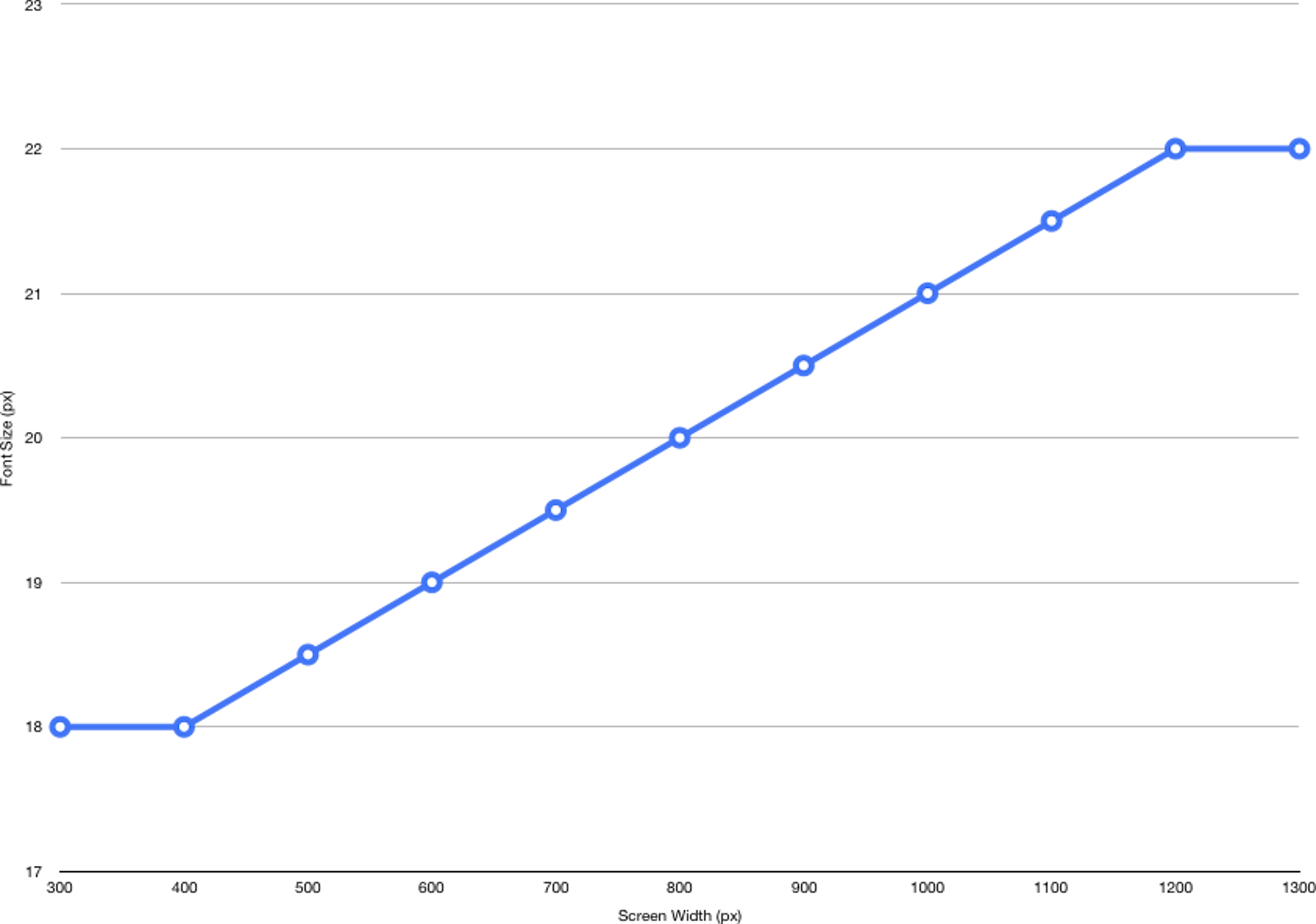
With Fluid Typography we'd scale the font-size relative to the width of the screen and between the 2 values, treating the mobile value as the smallest possible font-size and the desktop as the largest. So, in effect, we want to calc() the following chart, where the X-Axis is the known screen width and the Y-Axis is the output.

Note that in our case we've assumed that the smallest scaling screen size is 400px wide and the largest is 1200px. The equation for this is as follows:
(1 / (largeScreen - smallScreen)) * (maxType - minType) * (screenWidth - smallScreen) + minTypeWhich in our case looks like:
(1 / (1200 - 400)) * (22 - 18) * (screenWidth - 400) + 18This equation will produce a linear scaling font-size, we now need to limit the equation at the top (1200px) and bottom (400px) values, we can do this using a couple of good ol' media queries:
.title {
  font-size: 18px;
}

@media screen and (min-width: 400px) {
  .title {
    font-size: calc((1 / (1200 - 400)) * (22 - 18) * (100vw - 400px) + 18px);
  }
}

@media screen and (min-width: 1200px) {
  .title {
    font-size: 22px;
  }
}
Now that your font is dynamic, you'll quickly realise that the rest of your design breaks or behaves inconsistently. Rectangles, images and the alike are likely to also need to be scaled along with your text - with exceptions.
Fluid Containers
It may sound obvious, but it's often the case that text containers are designed as if the text perfectly wraps at the same character as the screen changes width, a difficult problem when the text also scales. To achieve this we can use CSS ems to scope the font-size to a wrapping element.
For example, lets say we had text that scaled from 18px-22px within the viewport sizes 400px-1200px (same as above), and we wanted the container element to scale according to the font-size.
<div class="title">
  <div class="box">
    My title in a box.
  </div>
</div>
.title {
font-size: 18px;
}
@media screen and (min-width: 400px) {
.title {
font-size: calc((1 / (1200 - 400)) * (22 - 18) * (100vw - 400px) + 18px);
}
}
@media screen and (min-width: 1200px) {
.title {
font-size: 22px;
}
}
.box {
width: 10em;
height: 10em;
background-color: tomato;
}Summary
Although this solution may seem a little unconventional and complex, it will hopefully, help in trying to build a system behind complex and nuanced designs where necessary.